Viewing a Dashboard
Dashboards allow you to combine key information from multiple projects in a single place.
There are 2 types of dashboard: A visual dashboard and a table dashboard.
A visual dashboard uses charts to illustrate your key data, it presents your data in a visual manner, and is great for printing high quality impactful posters.
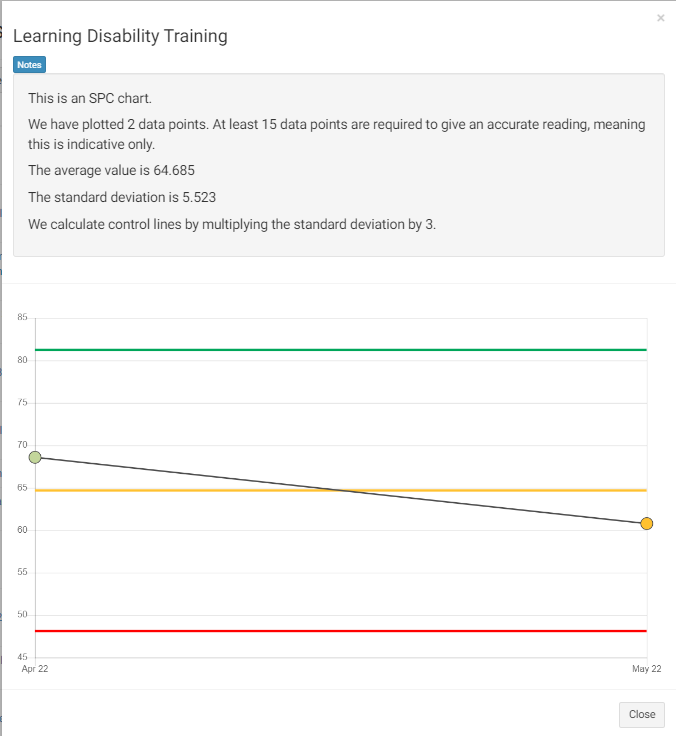
A table dashboard uses a table format. It allows you to drill down into your data, compare it easily to your targets and generate statistical process control charts (SPC charts).
Below is an example of a table dashboard reporting on training. As you can see it shows the metric in the first column and results for the relevant filtered dates.
The colour of the cells illustrate how the results rank in terms of the pre-established red/amber/green targets. The progress column shows whether the results are improving over time or not.
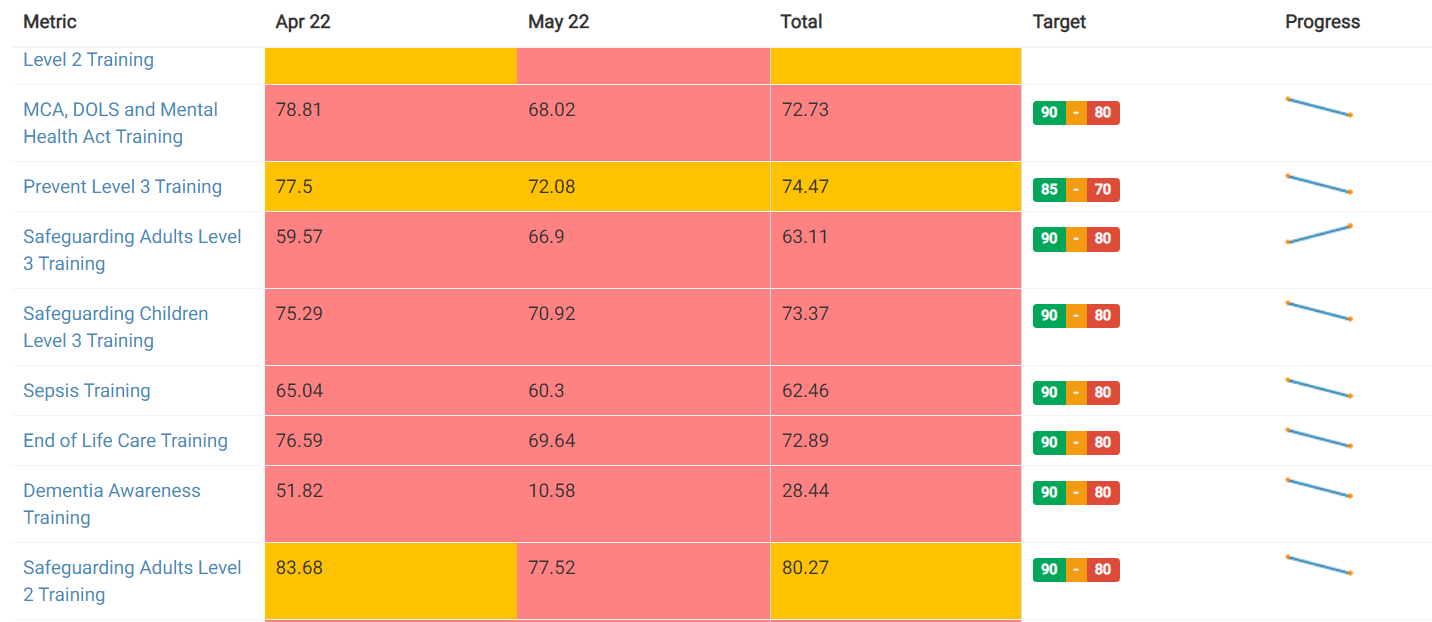
Clicking on a progress chart will allow you to view the statistical process control chart (SPC chart) and how your results fall within the targets set in more detail.
Clicking on any metric will allow you to go back in and edit that metric.