Reports (summary)
Reports are an effective way of understanding and communicating the data that has been collected through your projects. They can display a summary of the data and provide details about individual reports.
To access the report section of your projects go to "projects" select the project that you wish to view by either scrolling down through your list of projects or searching for it in the search bar.
Click on the "action" button next to your project.
The first option in the drop down menu is to enter data for your project. See entering data for more information on this.
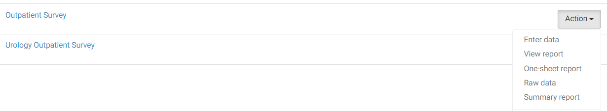
In terms of reports we are presented with four options here:
- View Report
- One- sheet report
- Raw data
- Summary report
Lets go through each of these in turn.
View Report
This area provides a detailed breakdown of results for each question in a single project.
You can filter the results by date or the services included.
Click on the orange "save/print" button in the top right hand corner to save the whole report as PDF, Word, Excel or Powerpoint. You can edit the way in which the data is displayed within these tools which is a very useful feature of the system, especially if you are used to working with this software. You can also view all raw data from the "Raw data" button.
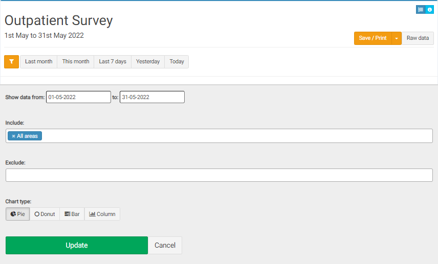
To show data for a set time period, click on the orange filter icon.This will allow you to specify exact dates, and filter the report by a service, group or setting within your organisation. You can also change the way your charts are displayed with the options of choosing between a pie, donut, bar or column chart. (Defaults to pie chart).
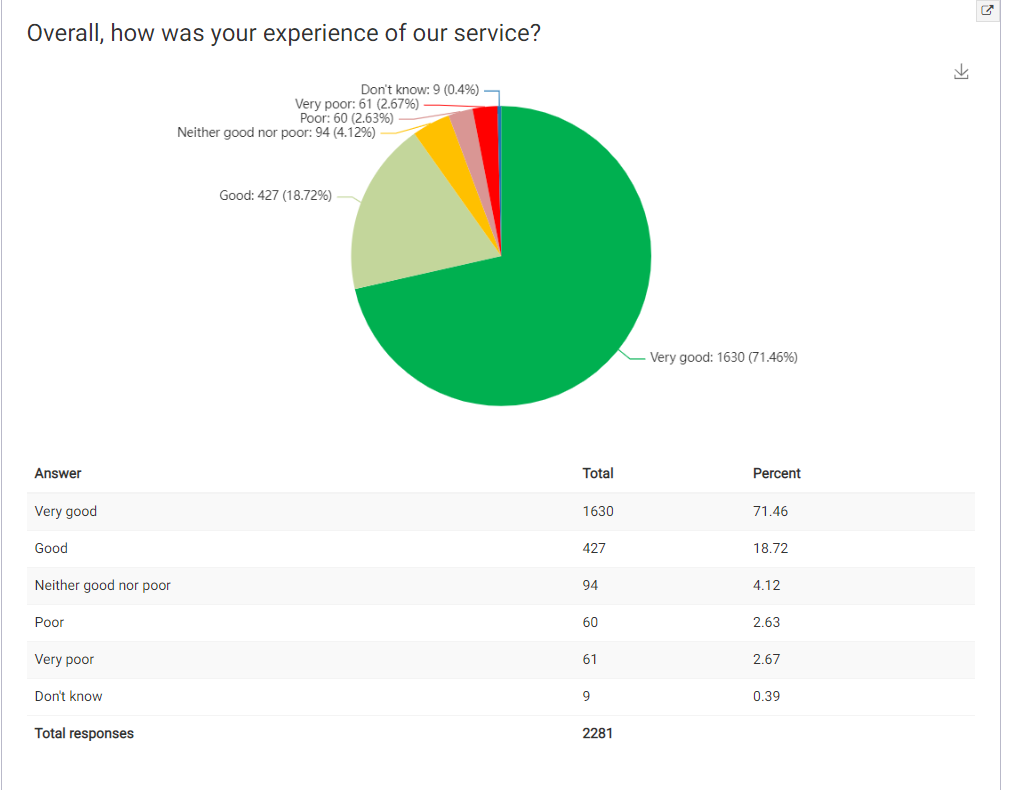
Your results - Charts:
Each question will have a summary chart - showing a breakdown of responses below it. You can download each chart individually by clicking on the download button next to it.
Your results - Comments:
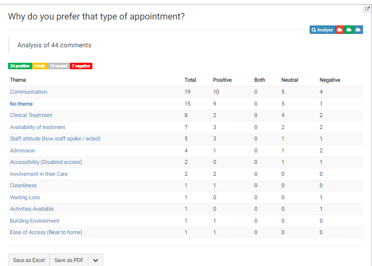
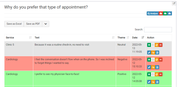
All comments are provided in a table - you can search or order any column, and export the text into Excel or PDF.
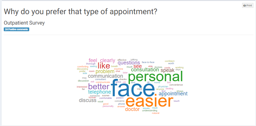
To view detailed analysis of the comments click on the blue button "analyse" in the top right hand corner of the comments table. You can also create wordclouds for the responses divided by sentiment, with the the red cloud being the negative comment word cloud, the green being the positive and the blue being the neutral.
Example of a positive word cloud:
If you have certain permissions you might also be able to go in and edit the sentiment of the comments here. This can be done under the action column with green being positive, white neutral, orange both and red negative.
The blue edit button allows you to edit the comment the orange speech bubble allows you to create "you said we did" report and the blue button next to it allows you to view all data for that comment:
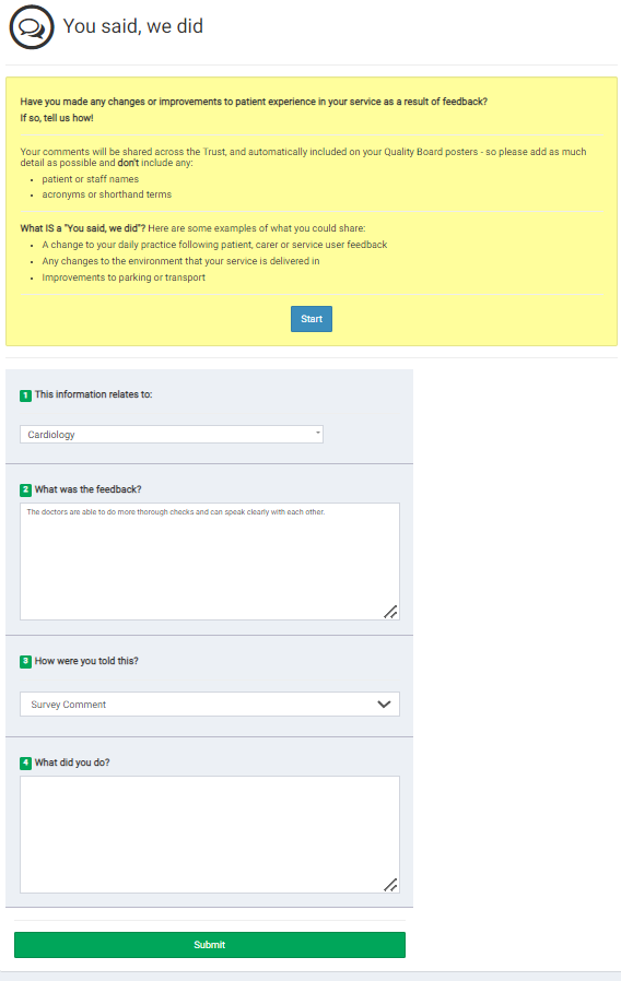
Example of a " You said, we did" report which allows you to action certain feedback:
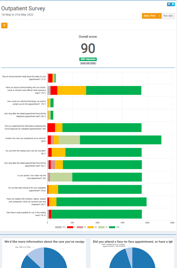
One Sheet Report
The next option on the dropdown action list is the "One Sheet Report". Rather than show the results of each question as an individual chart (as in the "view" report section) , this report shows you the results of all of the questions in one chart, summarized in a "one sheet" format. This is especially useful when giving an overall snapshot of the data.
You can also hover over the data for more detail, and filter and save it in different formats similar to the functionality of the "view" report section.
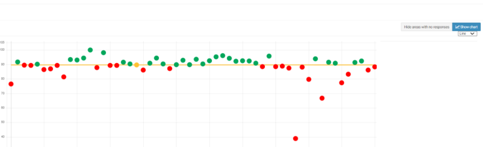
Summary Report
Where the "view" report and "one sheet" report both allow you to look at the data by question, the "summary" report allows you to view a summary of the data by area/location within your organisation. This allows you to compare data collected by different areas and see if there are any areas that are standing out (either positively or negatively)
The first page will display a chart with all of the responses divided by area. Click on the "show chart" button on the top right hand corner to identify any outliers. You can choose to view as either a line chart or a radar chart.
Line chart:
Radar Chart:
Hover over the outlier to see the name of the area, and then search for that area from your data chart. From there you will be brought back into that specific one sheet report where you can see if the issue is an error or if you need to create an action plan against it.
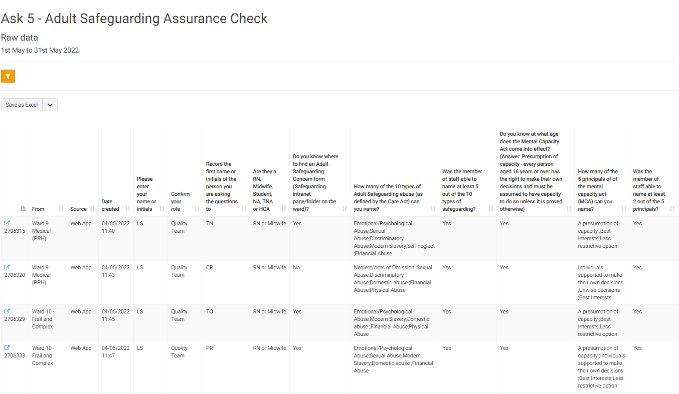
Raw Data Chart
This section gives you line by line responses to each project to allow for further analysis and filtering. You can choose the "show score" layout which shows the weighted results of the answers (quantative) rather than the comments themselves (qualitative). Clicking on any record will bring you back to the project/survey itself with the responses highlighted in red or green depending on the overall average sentiment of the responses. You can also export and save the raw data through the "save as" button.